Wellness / Skincare
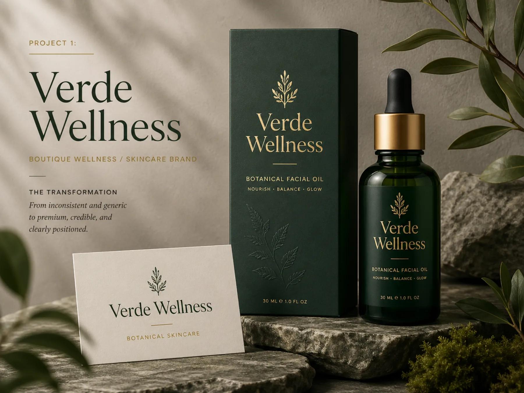
Verde Wellness
From inconsistent and generic to premium, credible, and clearly positioned.
Before / After
From generic wellness cues to a brand built for trust.
Verde Wellness already had a calm, natural direction, but the original identity relied on familiar wellness cues that made the brand feel easy to overlook. The rebrand focused on building more trust, clarity, and premium presence across packaging, print, and customer touchpoints.
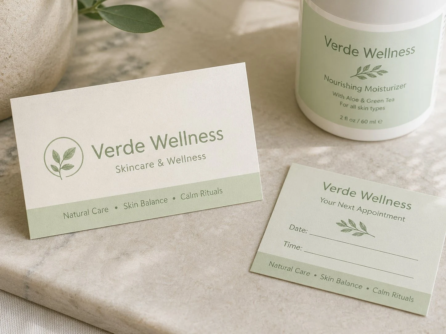
The previous identity felt clean and approachable, but the pale green palette, leaf symbol, and soft typography made the brand feel generic rather than distinctive.
The new identity gives Verde a more confident botanical language, stronger hierarchy, richer color, and a more premium skincare presence.
Client Request
Create a calmer, more credible skincare identity that feels natural but also more premium and trustworthy.
What Wasn't Working
The old brand looked clean, but it blended into the wellness category with familiar colors, soft type, and expected botanical cues.
What We Changed
We refined the visual hierarchy, deepened the color palette, strengthened the typography, and built a more consistent packaging and collateral system.
Result
Verde now feels more distinctive, polished, and ready for higher-value skincare and wellness clients.
Brand Direction
A clearer visual system built for trust.
This project shows how brand identity can move a business away from generic visuals and into a more cohesive, premium, and memorable market presence.
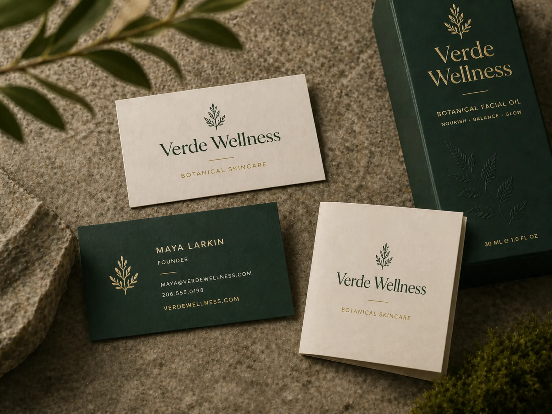
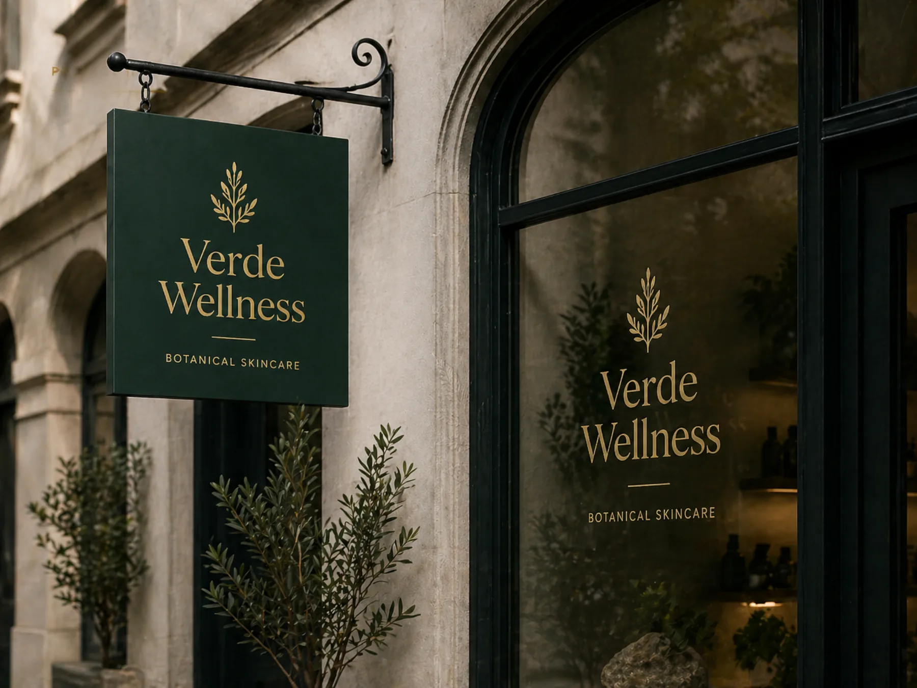
Applications
Designed to work beyond the logo.
The identity is shown across collateral, printed materials, packaging, signage, and digital touchpoints so the brand feels consistent wherever a client meets it.
What Changed
A shift in how the
business is perceived.
The rebrand gave Verde Wellness a cohesive visual language that made every touchpoint feel intentional — from packaging to signage. The brand now communicates the same level of quality as the product behind it.
Start your
transformation.
Ready to make your business look as established as the work behind it?
Start Your Brand Project →