Family Dental Practice
Harbor & Reed Dental
A family dental practice rebrand shaped around trust, calm, and professional care.
Before / After
From generic dental to a brand built for patient trust.
Harbor & Reed Dental already delivered careful, personal care — but the identity said otherwise. The previous visual system relied on common dental cues that felt functional, forgettable, and disconnected from the level of professionalism behind the practice. The rebrand gave the practice a presence that patients could feel before the first appointment.
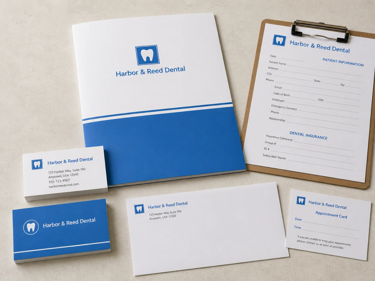
The previous identity relied on a bright blue palette, a generic tooth icon, and office-supply materials that communicated dental function but not warmth, trust, or professional distinction.
The new identity replaces generic office materials with a calm, cohesive brand system — refined typography, a restrained color palette, and patient-facing touchpoints that feel warmer, more considered, and more trustworthy.
Client Request
Create an identity that feels less generic and more established — a brand that communicates professionalism, warmth, and patient trust from the first impression.
What Wasn't Working
The old brand looked like a typical dental office: bright blue, tooth icon, office materials. Nothing distinguished the practice or communicated the quality of care behind it.
What We Changed
We replaced the generic palette and iconography with a refined wordmark, quieter color system, and a cohesive suite of patient-facing materials that feel calm and professionally credible.
Result
Harbor & Reed Dental now presents as a trusted, established practice — across the storefront, reception, and every patient touchpoint.
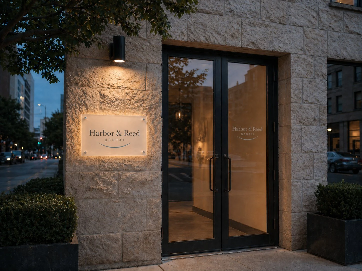
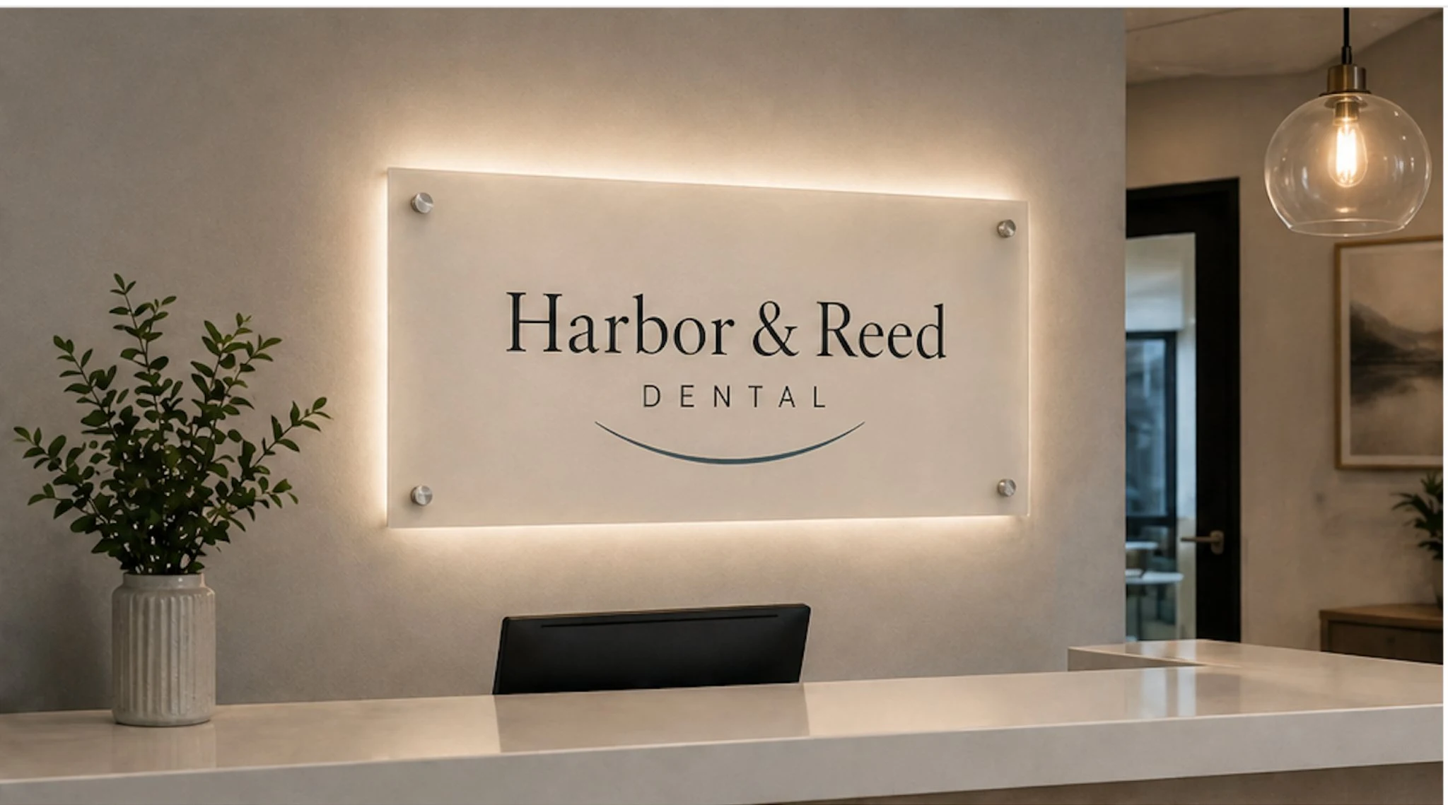
Brand in Space
An identity that works where patients arrive.
The illuminated exterior sign and interior reception wall both carry the same calm, confident identity — so patients experience a consistent brand presence from the street to the front desk. Environmental application was a central part of the project brief.
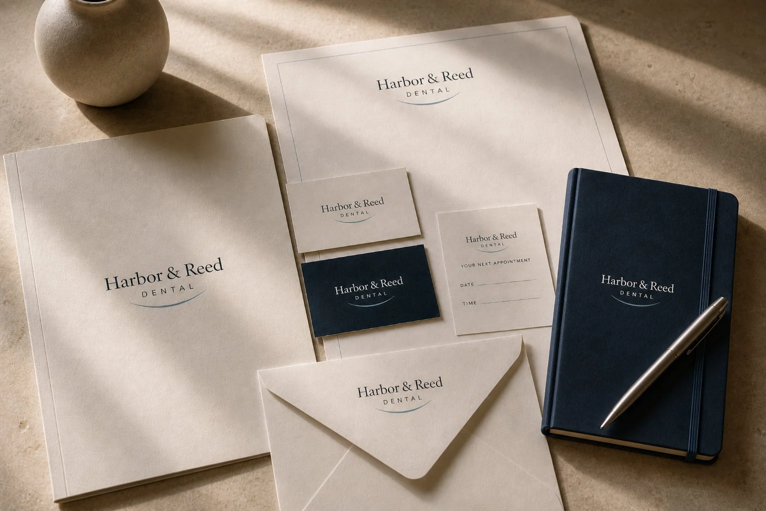
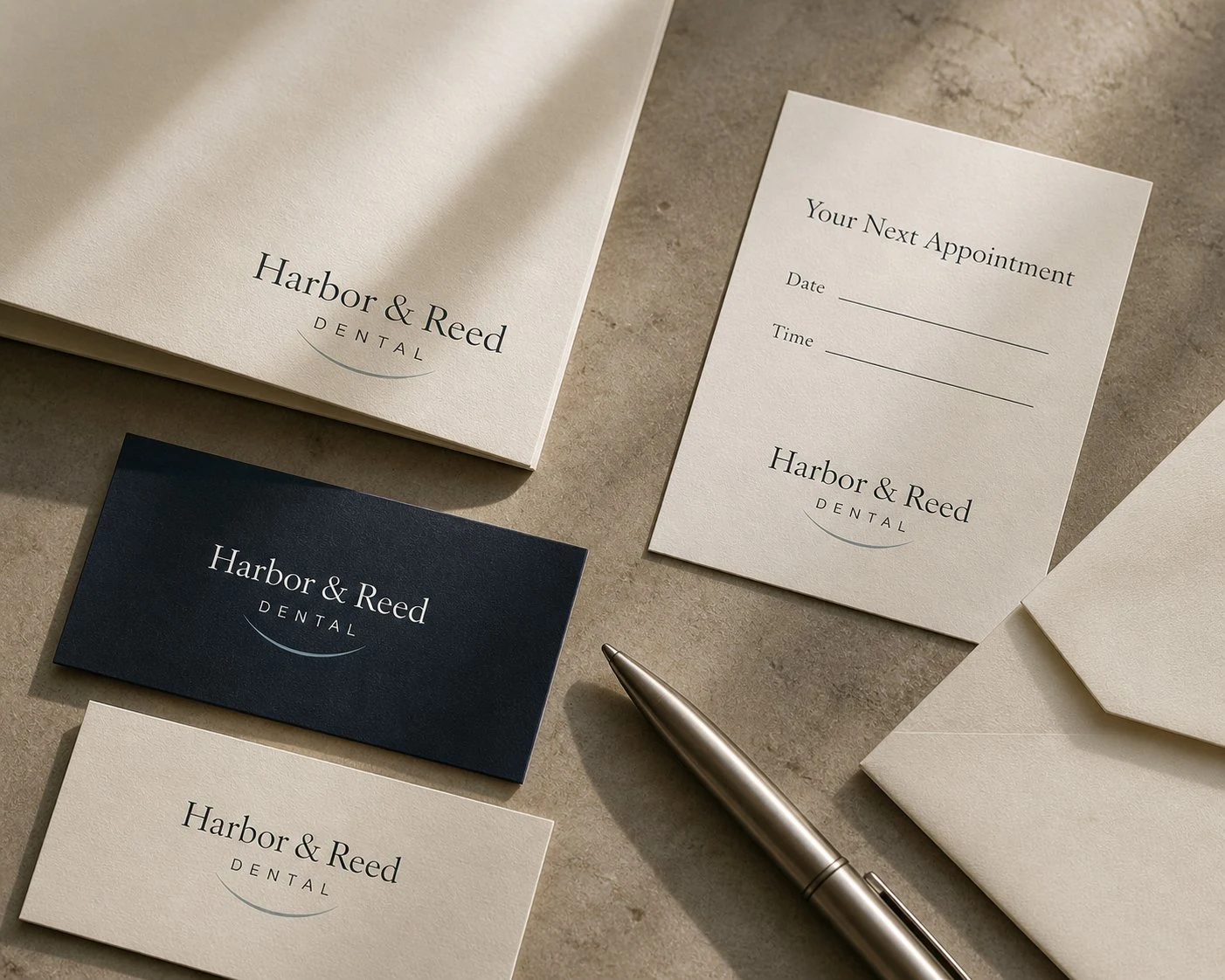
Patient Touchpoints
The materials patients hold matter.
Appointment cards, business cards, envelope details, and a refined metal pen — each object was considered as part of the patient experience. When every touchpoint carries the same visual logic, the brand communicates trust before a word is spoken.
Start your
transformation.
Ready to make your business look as established as the work behind it?
Start Your Brand Project →